01
Challenge
Bottling Magic
Mad Magic Kombucha started in 2010 in a small town in Northern Virginia, under the name MTO (Made To Order) Kombucha. Their kombucha is hand-brewed using traditional techniques, crafted with only organic ingredients, and contains no artificial ingredients, artificial flavorings, or added sugar.
Faced with increased market competition and out-dated branding, MTO Kombucha was struggling with customer acquisition and distribution expansion. They needed their brand to represent both their personality and the things that made them different from all other kombucha brewers.
02
Solution
Brew Passion
In collaboration with the MTOK team, Wildfire executed a complete brand overhaul. From naming to website, the MTOK brand became Mad Magic Kombucha. Mad Magic pulls the essence out of MTOK’s history and mission and brings the brand into the 21st Century. Allowing the product to compete alongside major kombucha brands across the east coast.
Campaign Components
- Company & product naming
- Logo design & guidelines
- Packaging
- Business cards
- Booth set up
- Van wraps
- Tri-fold brochure
- Tap Handle
- Website
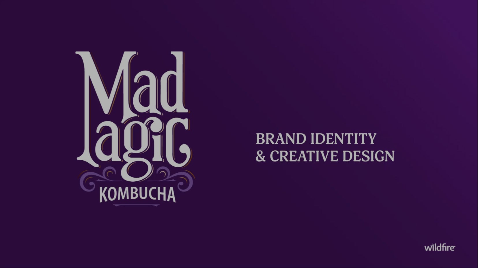
Brand Identity & Creative Design
We took a raw kombucha brand and bottled up all the magic instead.
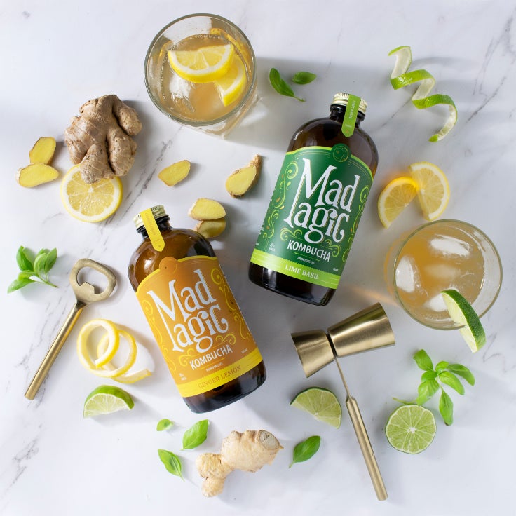
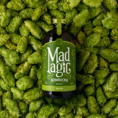
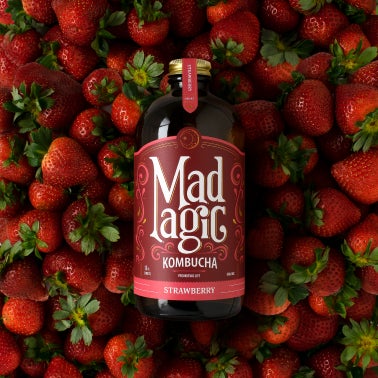
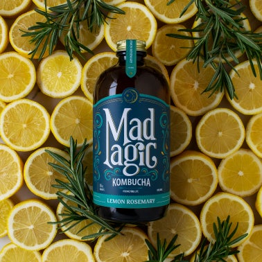
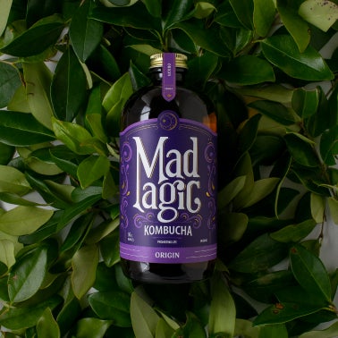
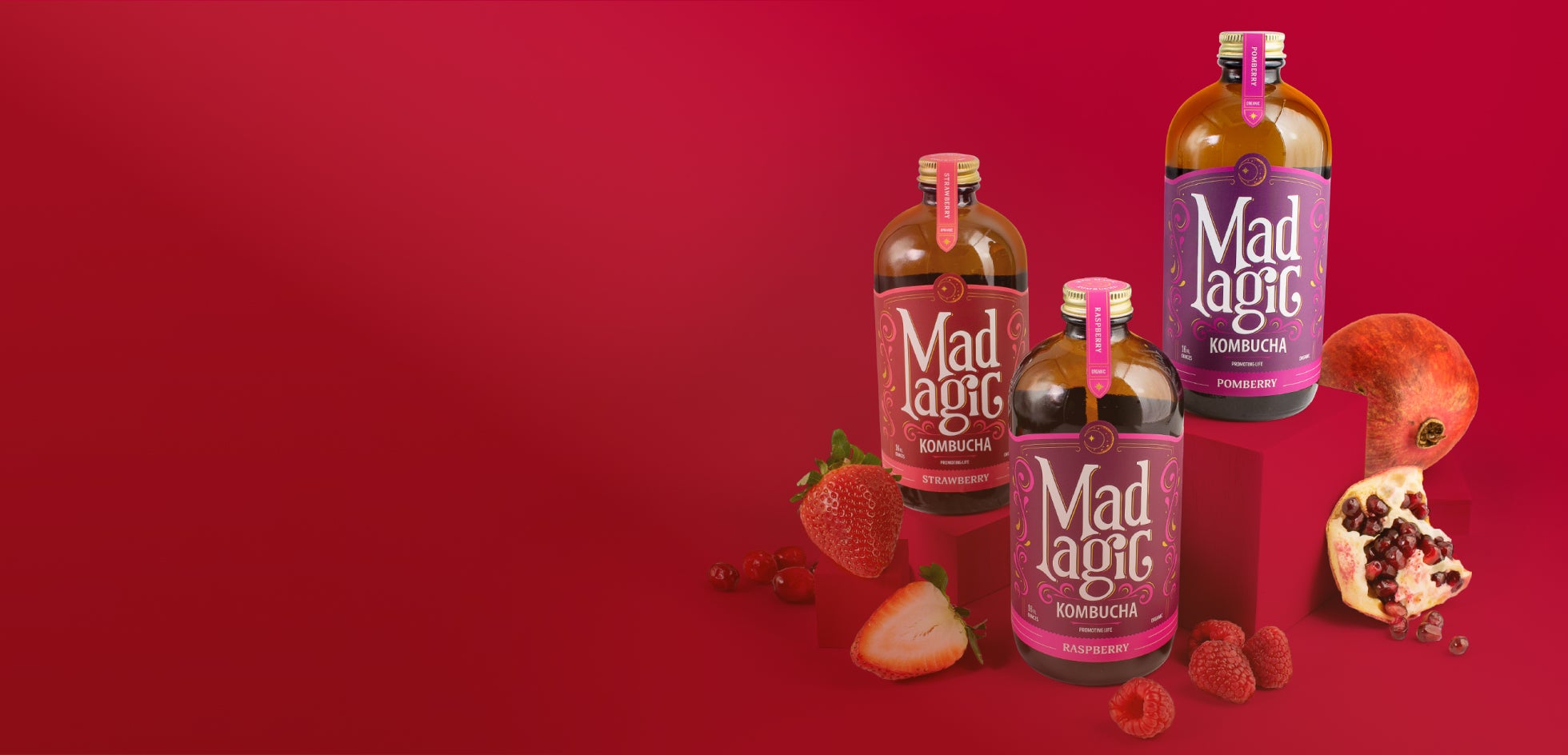
Packaging Design
With a whole new identity, we developed packaging to standout on the retail shelf amongst national brand equivalents.
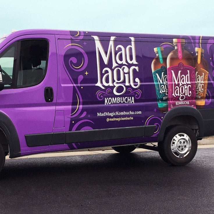
Van Wraps
We grabbed attention on the road with new van wraps showcasing our top flavors.
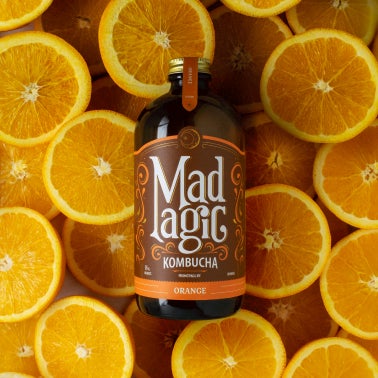
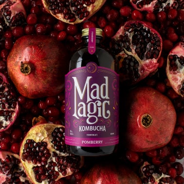
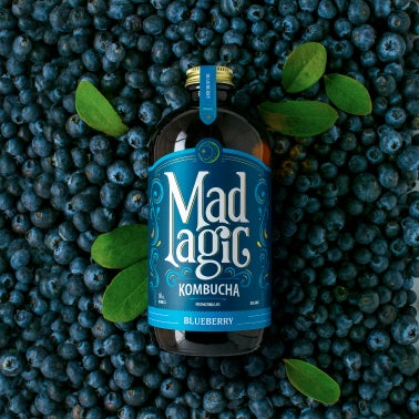
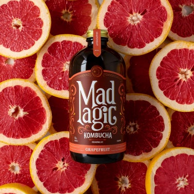
Product Photography
The magic of every bottle was captured in our content studio where we highlighted the real fruits behind each flavor.
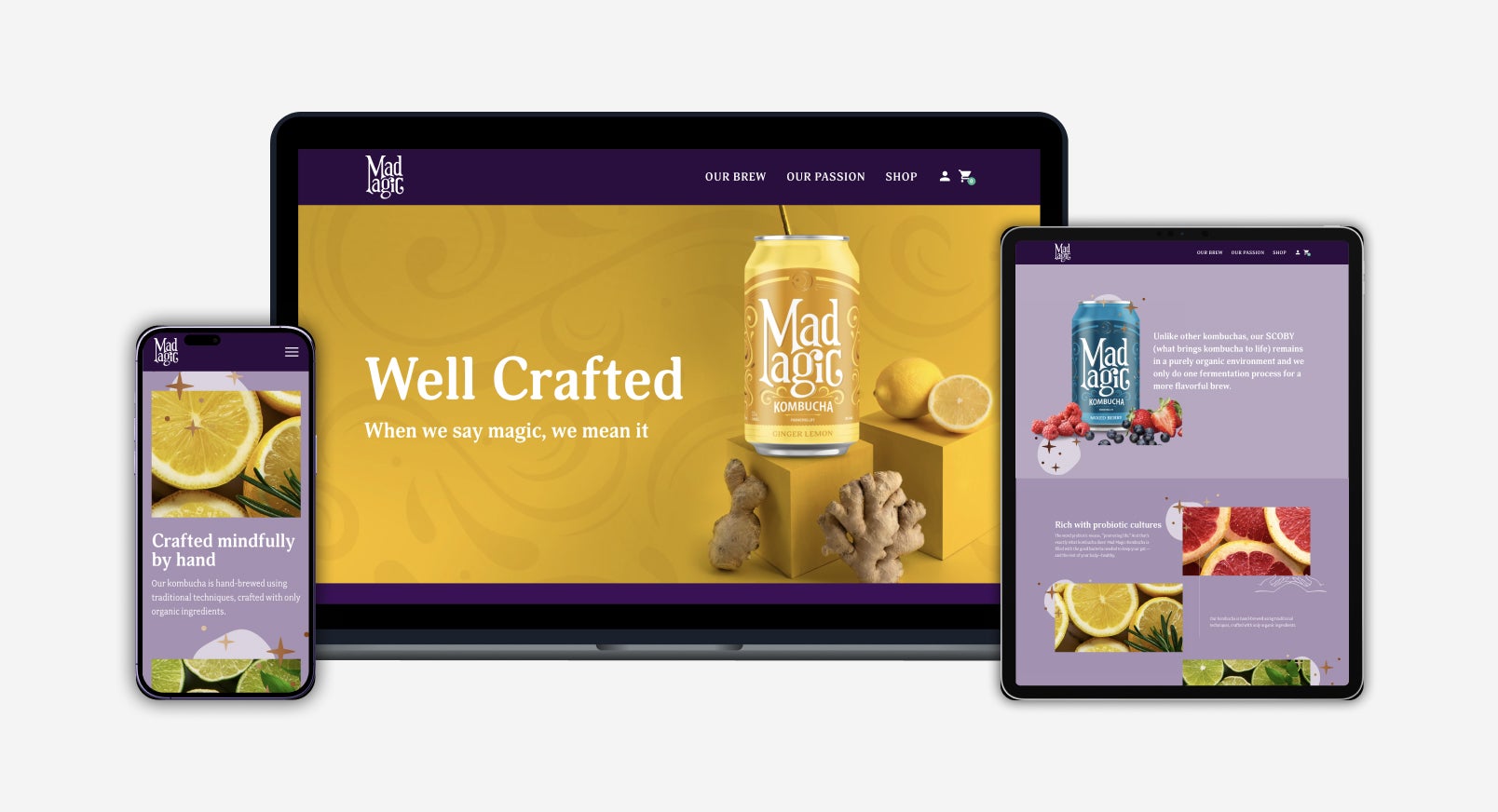
Homepage for Desktop
The magic met the web in a brand new website focused on user experience and e-commerce sales.
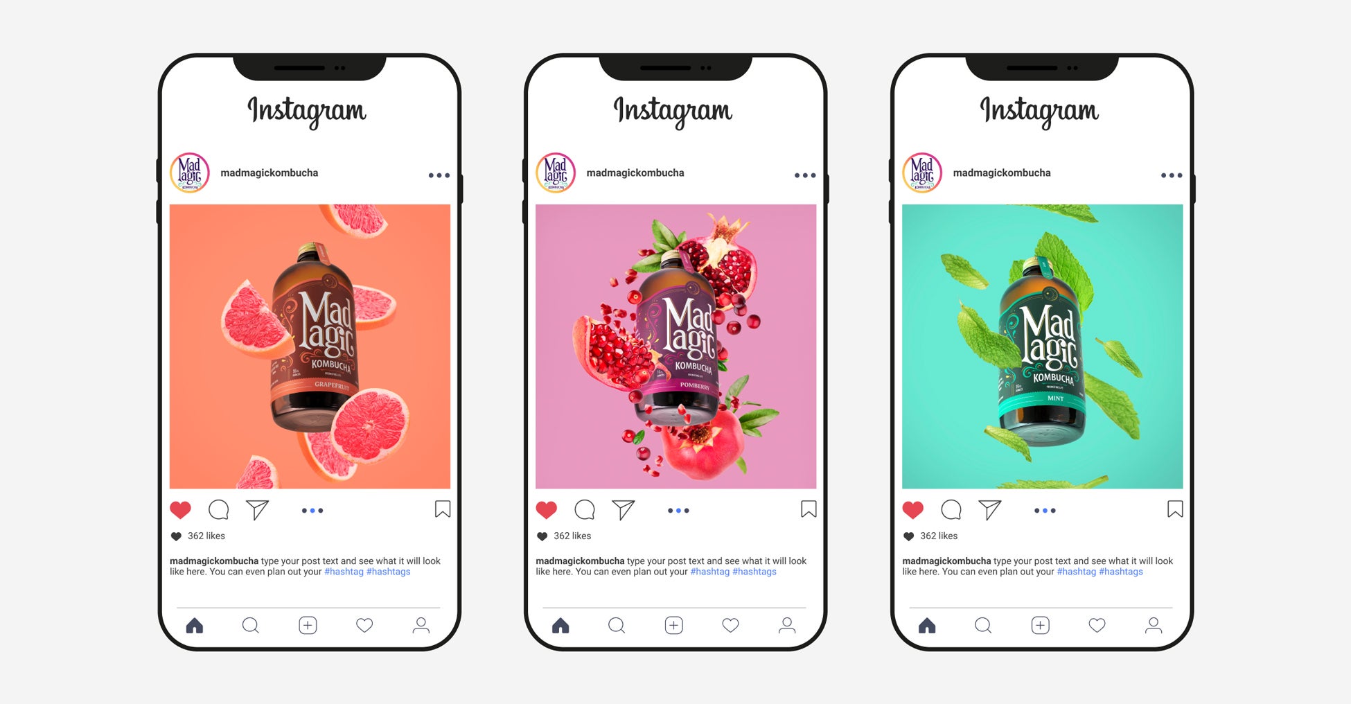
Paid Media Photography
Eye-catching visuals drove new users to the website (236% increase!) from paid media ads.
03
Results
Igniting Growth,
Empowering Success
During the initial brand rollout, which consisted of the website launch and organic and paid social media introduction, Mad Magic Kombucha saw a significant increase in customer engagement and sales.
On social media specifically, Mad Magic’s new brand garnered a:
- 14% increase in social media followers
- 164% increase in social media impressions
- 102% increase in social media engagements
236%
Increase in website visits from paid social
13x
Increase in web purchase
2.4x
Returns on ad spend
Credits
Creative Director
Jane Doe
Brand Lead
Jane Doe
Designer
Jane Doe
Developer
Jane Doe
Creative Director
Jane Doe
Brand Lead
Jane Doe
Designer
Jane Doe
Developer
Jane Doe
Creative Director
Jane Doe
Brand Lead
Jane Doe
Designer
Jane Doe
Developer
Jane Doe