01
Challenge
Turning Friction into Flow for a Performance Brand
Cheribundi is a staple for athletes and health-conscious consumers, but their digital experience did not reflect their market leadership. The existing homepage lacked a clear visual hierarchy. This forced users to navigate through unoptimized content blocks to find essential information like product features and subscription options.
On the Product Detail Pages (PDPs), critical details like nutritional facts and customer reviews were buried. These cluttered modules and inconsistent layouts made it difficult for users to evaluate products quickly. To maintain their position in a competitive market, Cheribundi required a high-performance ecommerce platform that reduced friction and improved brand trust.
02
Solution
A Clean, ADA-Compliant, and Conversion-First Redesign
We overhauled the homepage and PDPs to create a more efficient and accessible shopping experience. By optimizing content placement and adjusting scroll lengths, we made product discovery more intuitive. The result is a high-performance platform that reduces user friction and supports the brand’s direct-to-consumer growth.
Key Technical & UX Pillars:
- High-Impact Visual Hierarchy: We refined the homepage structure to prioritize subscriptions and ambassador stories. This improvement in navigation efficiency ensures that users find the most relevant information immediately.
- Data-Driven PDP Layouts: We prioritized nutritional clarity by moving the buy box and supplement facts above the fold. Surfacing the data that drives purchasing decisions helps increase conversion rates and improves the user experience.
- Inclusive Design Standards: We prioritized accessibility from the start. By ensuring the entire site meets WCAG standards, we made the Cheribundi brand usable for all consumers.
- Streamlined Path to Purchase: We established a consistent design language and removed redundant modules. This created a cleaner and more intuitive journey from initial discovery to final checkout.
The final result is a professional ecommerce ecosystem that supports the performance goals of the Cheribundi brand.
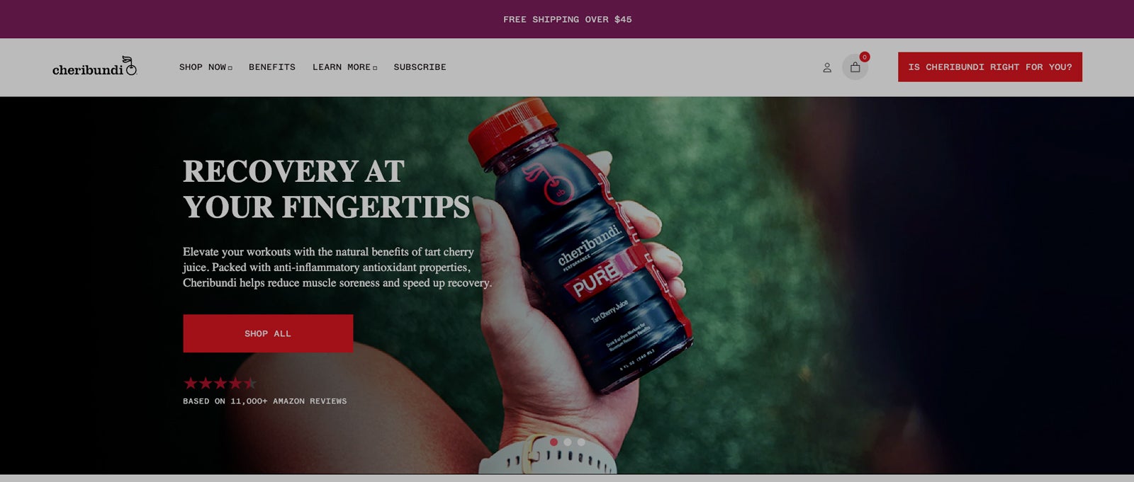
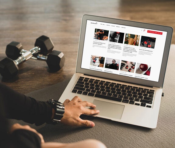
Homepage
Strategic Homepage Design: The redesigned homepage uses a clear visual hierarchy to guide users toward high-performance products and athlete stories.
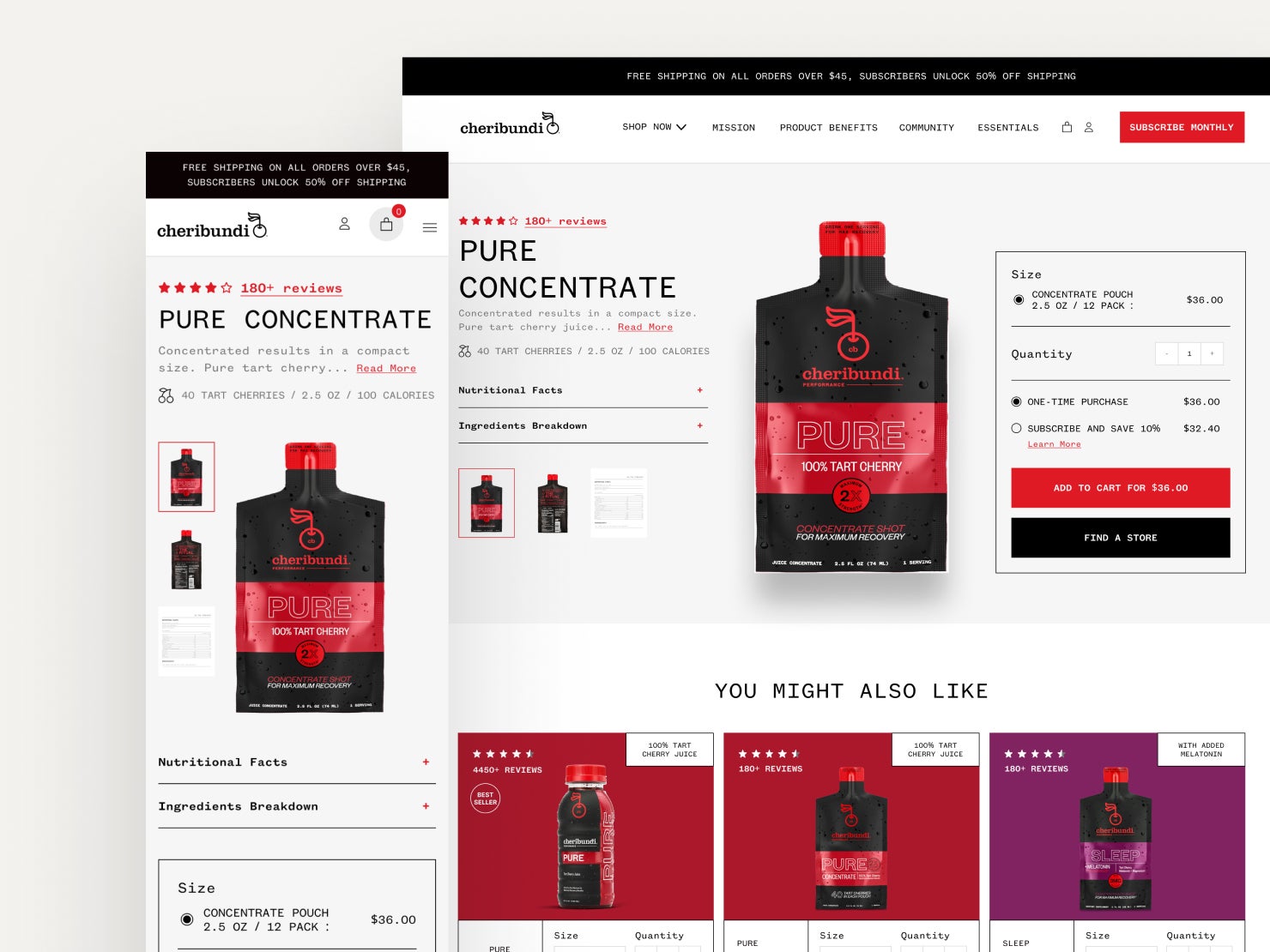
Buy Box
Insight-Led Design: Knowing that nutrition facts were the #1 user click on the PDP, we prioritized clarity by bringing the buy box and nutritional facts above the fold. We surfaced the data that drives the decision, right where it’s needed most.
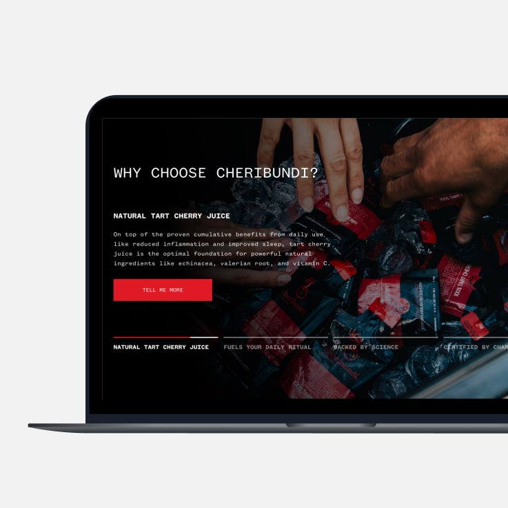
Why Choose Cheribundi?
We redesigned the ‘Why Cheribundi’ module to distill complex performance benefits into bite-sized, digestible insights. By focusing on the user’s need for quick validation, we made it easy to see exactly how the product supports their recovery routine.
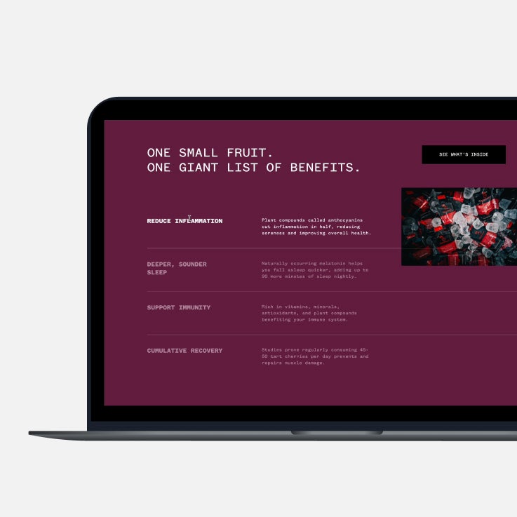
Benefits
Scannable Benefits: To support fast-paced decision making, we translated complex product science into a high-impact benefits module. By using clear icons and focused copy, we ensure users can validate the product’s value in seconds.
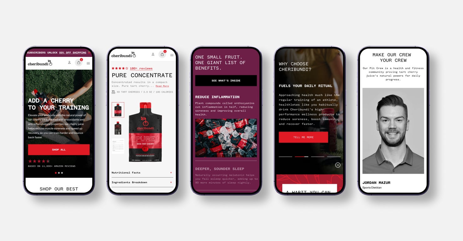
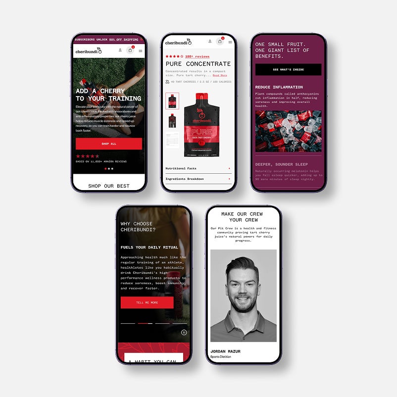
Mobile
Optimized Mobile UX: We ensured the mobile experience is fast and responsive. Every interaction is thumb-friendly to keep up with the active lifestyle of the Cheribundi customer.