Mad Magic Kombucha: Brand Identity
Sip the stark raving goodness
Mad Magic Kombucha started in 2010 in a small town in Northern Virginia, under the name MTO Kombucha. Their kombucha is hand-brewed using traditional techniques, crafted with only organic ingredients, and contains no artificial ingredients, artificial flavorings, or added sugar. See case study video

THE CHALLENGE
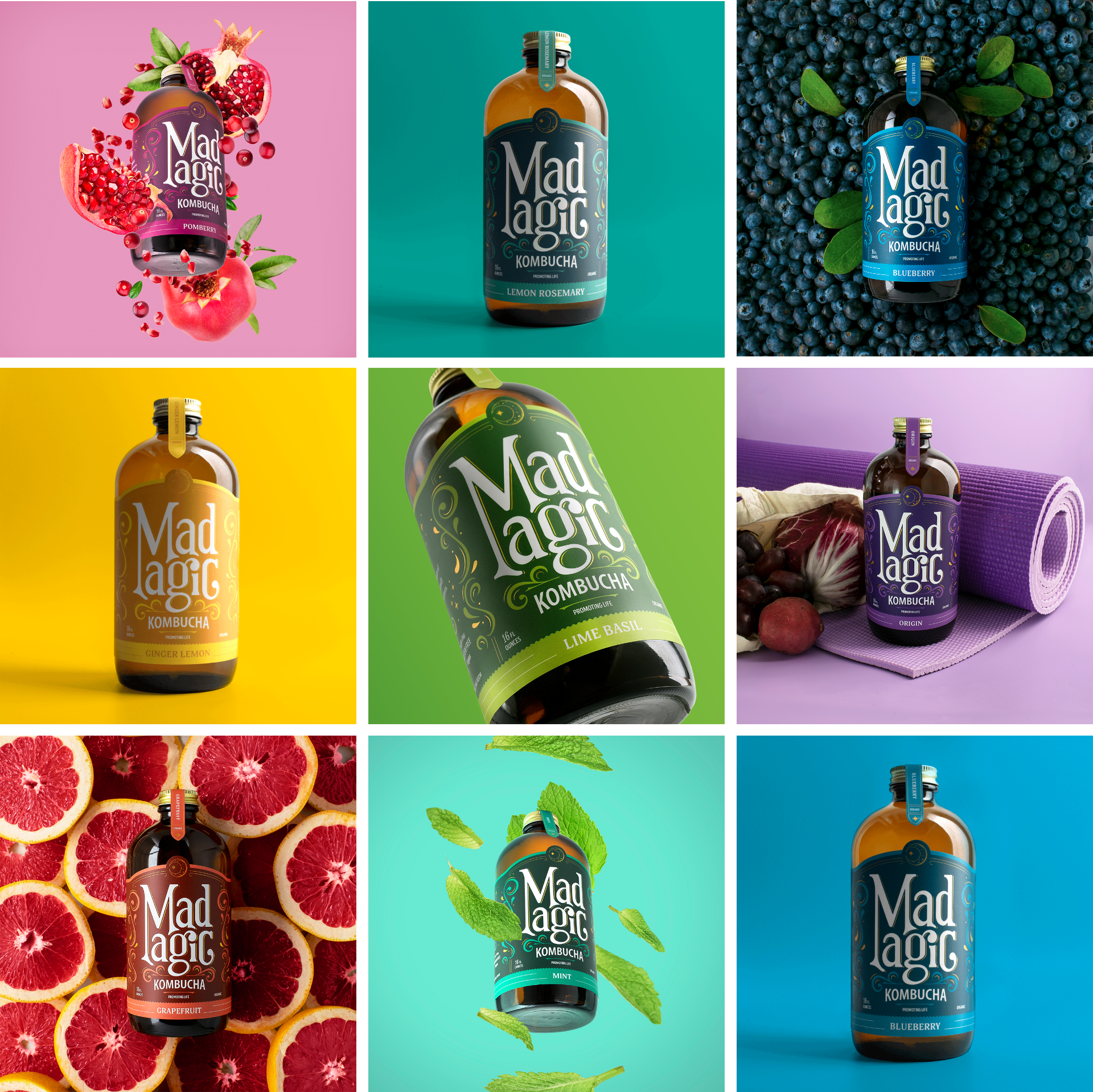
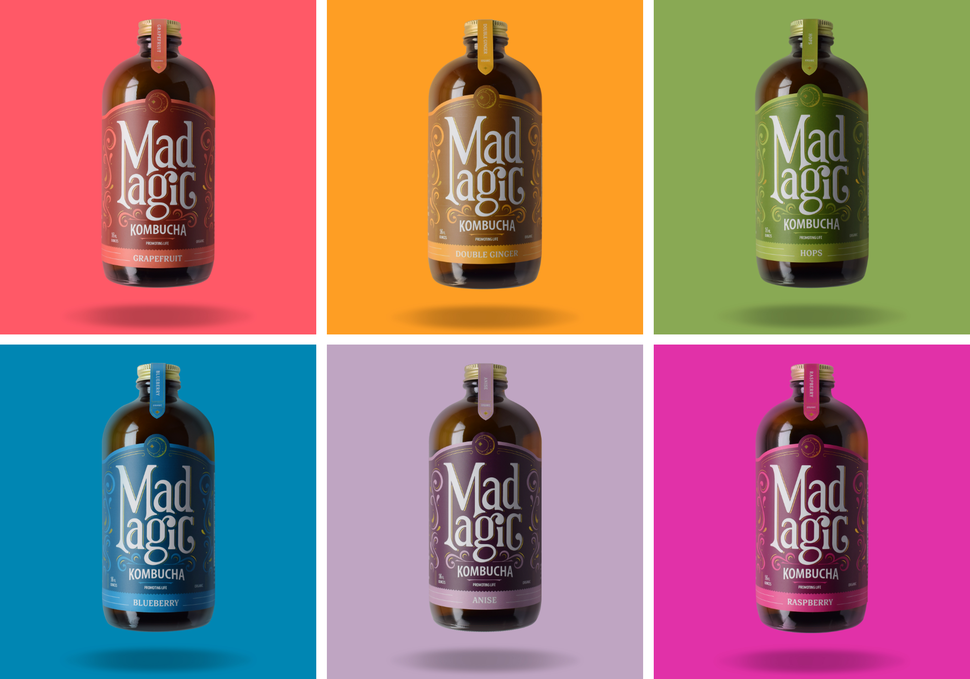
MTO was suffering from low brand equity and customer loyalty. While their product was great, they were still struggling increase ecommerce traffic and hit sales goals. The name MTO (Made to Order) was not resonating with consumers, and their label needed to stand out in the competitive kombucha category without losing its overall look and feel when translated across their 19 flavors.
WHAT WE DID
Design
Brand Identity
Social
Website
THE SOLUTION
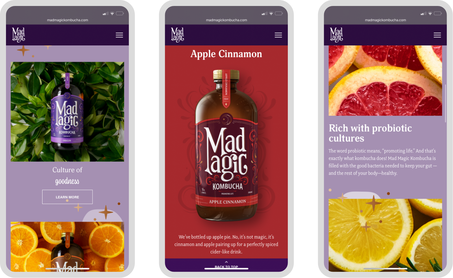
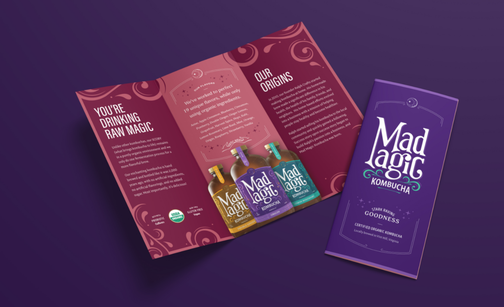
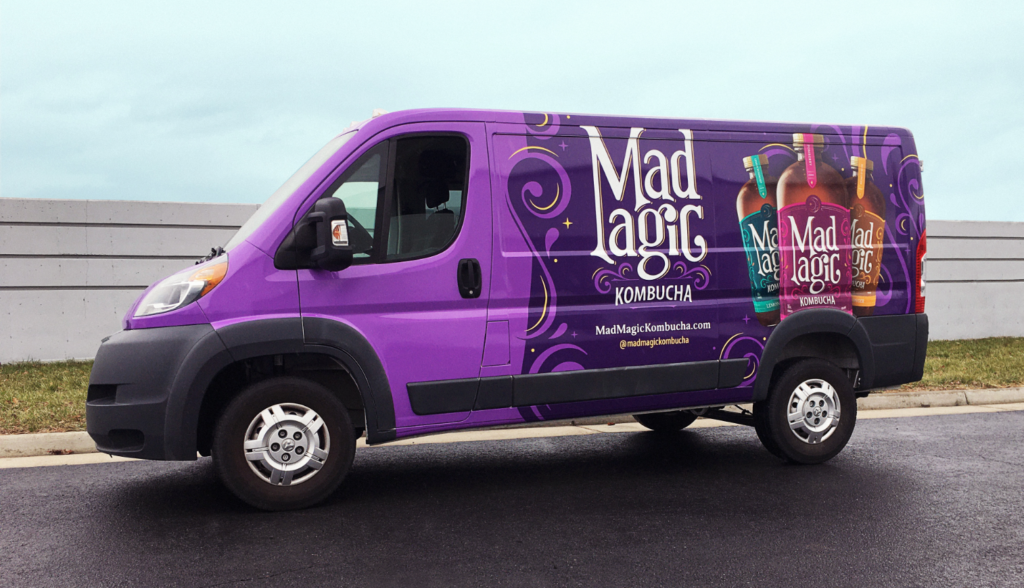
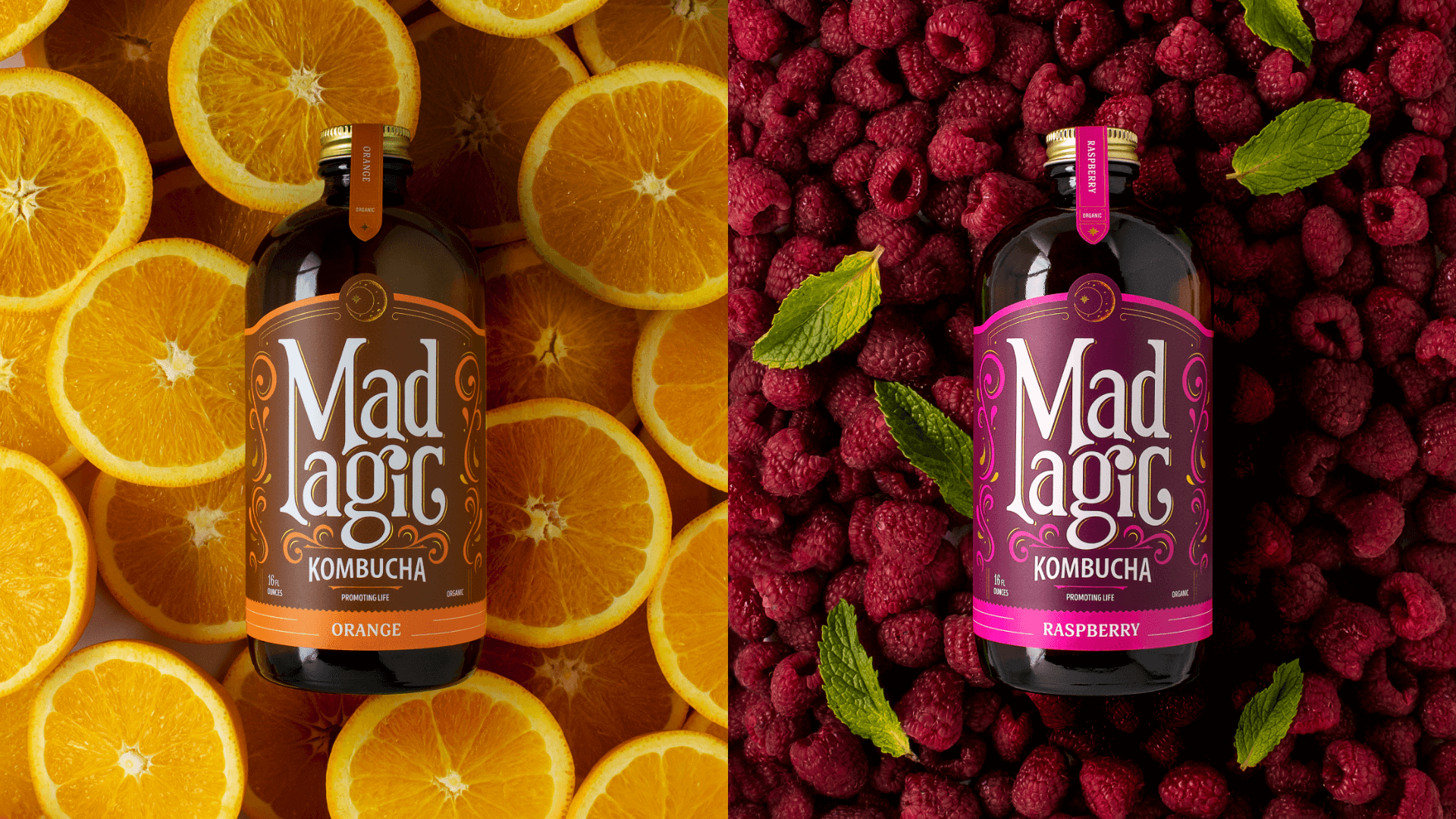
Wildfire worked to create a brand that conveyed both the health benefits of kombucha and the rather mad-man passion behind their brewing process — and Mad Magic was born. For the design, we leaned into magic and garnered inspiration from apothecary and liquor bottles. With a fresher name, logo, packaging, and website, Mad Magic was able to convey that when they say magic, they mean it.
While the brand rollout is in its initial phase and awareness of the new brand is still growing, Mad Magic Kombucha is already seeing a significant increase in customer engagement and sales compared to MTO Kombucha. Year over year, social media followers increased by 14%, impressions increased by 164%, and engagements were up by 102%. Website visits from paid social are up 236% year over year, and website purchases have increased 13X, with returns on ad spends as high as 2.4X.
Wildfire is one of the Top Packaging Design Companies Of 2020
